Project
Expense App
About the Project
For the User Interface Design course, I was tasked with shaping the visual identity of a brand-new Expense App. While the structure and user flows had already been established through initial wireframes, the full responsibility for the visual and aesthetic aspects rested on my shoulders.
The goal was to transform a plain, utilitarian financial overview into an intuitive, modern, and visually compelling application that motivates users to keep track of their finances.
The Challenge & Focus
The biggest challenge of this project was finding the perfect balance between functionality and aesthetics. A financial app requires a high degree of readability and clarity, yet it must not feel dull or uninspiring.
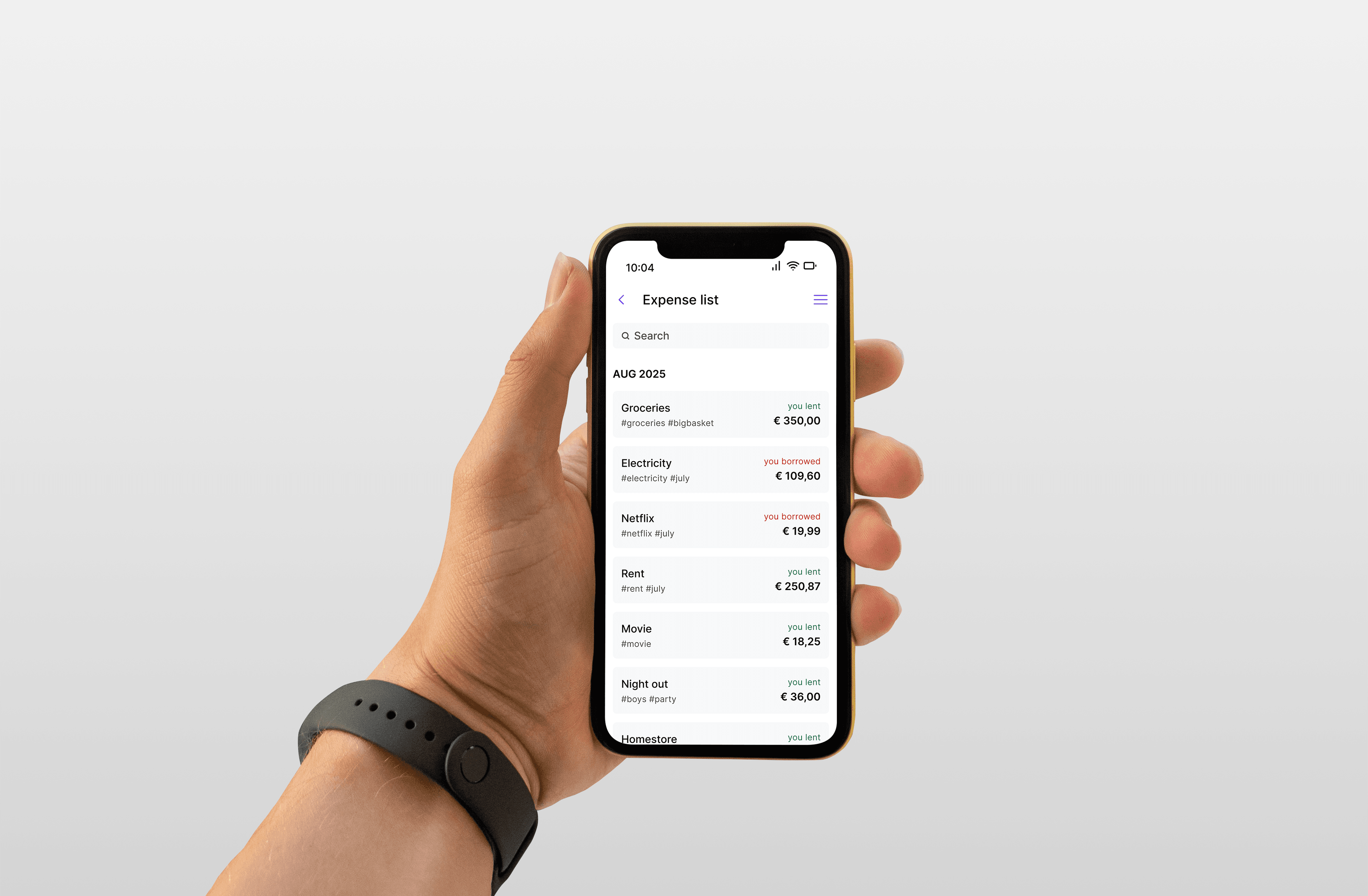
My core responsibilities included:
- Translating low-fidelity wireframes into high-fidelity (pixel-perfect) designs.
- Defining the complete visual style (color palette, typography, spacing).
- Designing reusable UI components (buttons, cards, input fields, charts).
How I Designed This (My Process)
Since I had to build the visual experience from the ground up, I followed a structured design process:
Step 1: Wireframe Analysis I began with a thorough analysis of the provided wireframes. I mapped out which elements held the highest priority—such as the current balance or the "add" button for new expenses—and determined how the information hierarchy should be supported visually.
Step 2: Visual Identity & Moodboarding Before designing the screens, I established the app's foundations:
- Color Palette: Given that this is a financial app, I sought colors that convey trust, calm, and clarity (e.g., combining bright accent colors for actions with muted tones for backgrounds). I also gave specific thought to the colors for income (positive) and expenses (negative).
- Typography: I chose a modern, sans-serif typeface that offers excellent readability, even for small numbers and dates on mobile screens.
Step 3: Components and Design System To ensure consistency across all screens, I built a mini-design system / UI kit. This included:
- Standardized buttons (Primary, Secondary, Ghost).
- Input fields with clear states (Active, Error, Filled).
- Visual representations for categories (icons combined with color codes for "groceries," "transport," or "leisure").
Step 4: High-Fidelity Design In the final phase, I applied the new visual identity to the bare-bones wireframes. I paid close attention to whitespace to allow the interface to breathe and to prevent "clutter." The end result was a series of attractive, organized, and user-friendly app screens that were ready for developer handoff.